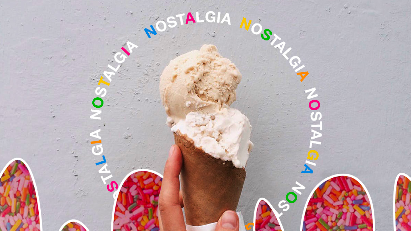
A package design project that visualizes data/information from a brand. This is an imagined ice cream brand called Holsm that is centered around transparency and authenticity with their process. This was a group collaboration that brought us to both digital and analog products.
Fellow Designers: Jacob Allen & Lilyana Bryan

Process >>>
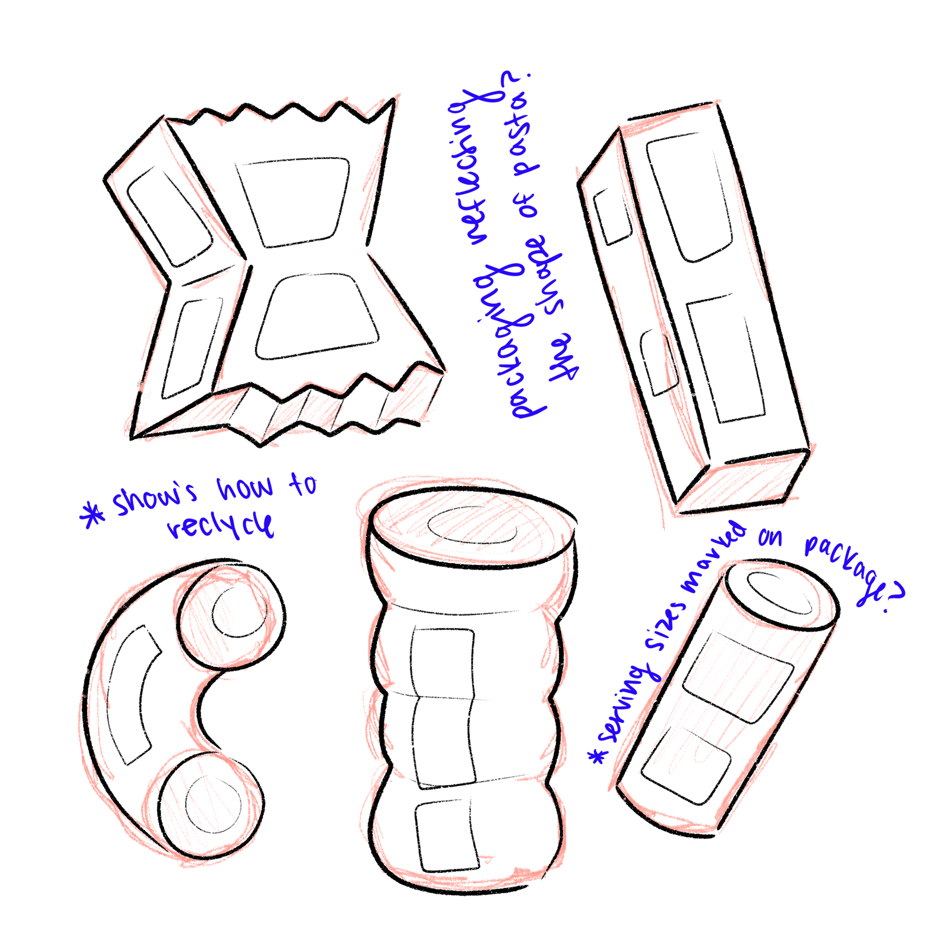
For this project, we were tasked to make packaging for a brand that would display information about the product (ie. the production, the sustainability, the impacts, etc.). To begin the process, we had came up with two different ideas before landing on one. My group, with Lilyana and Jacob, landed on making packaging for either ice cream or pasta. Both would center on recycling but there would still be heavy differences. These are my sketches for these ideas.
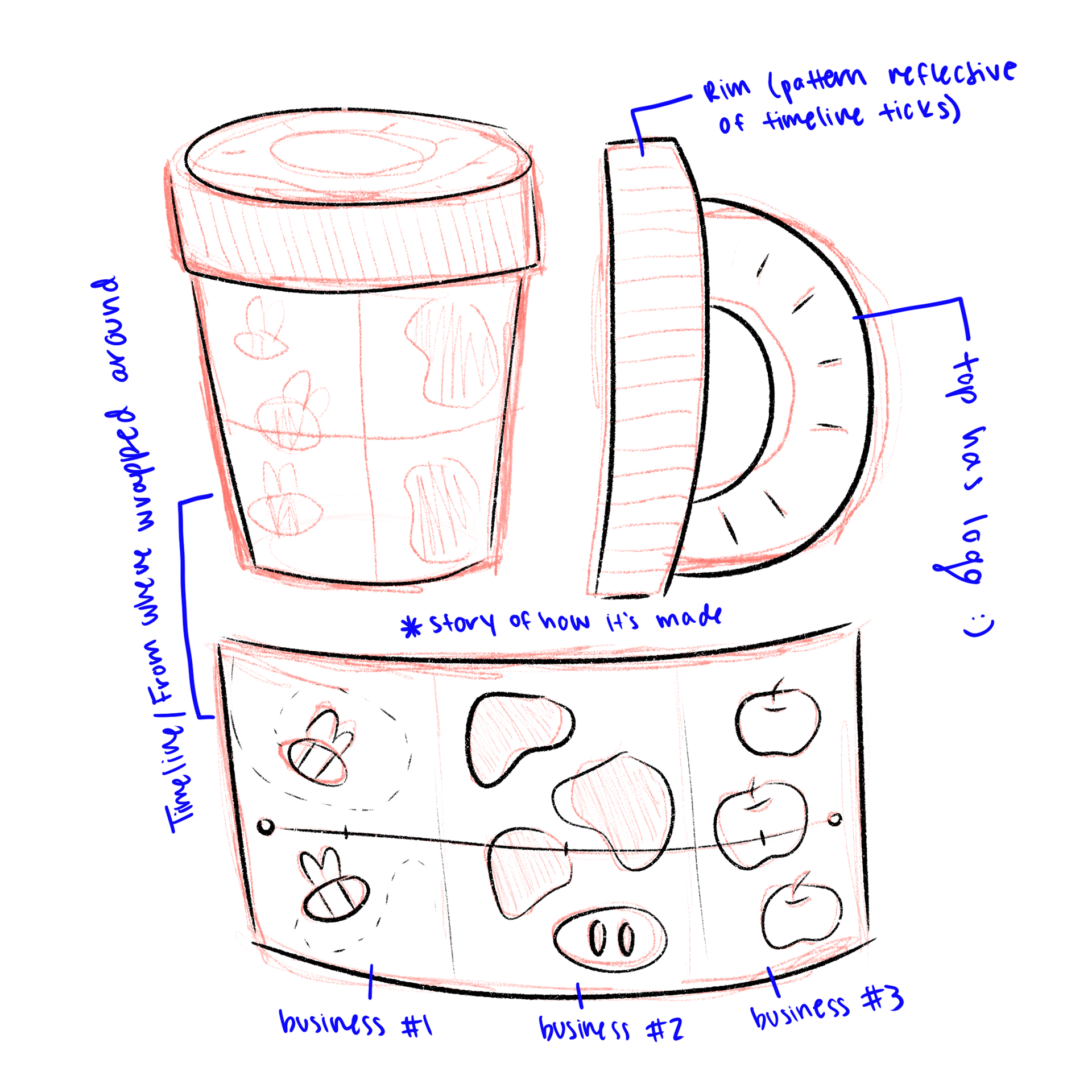
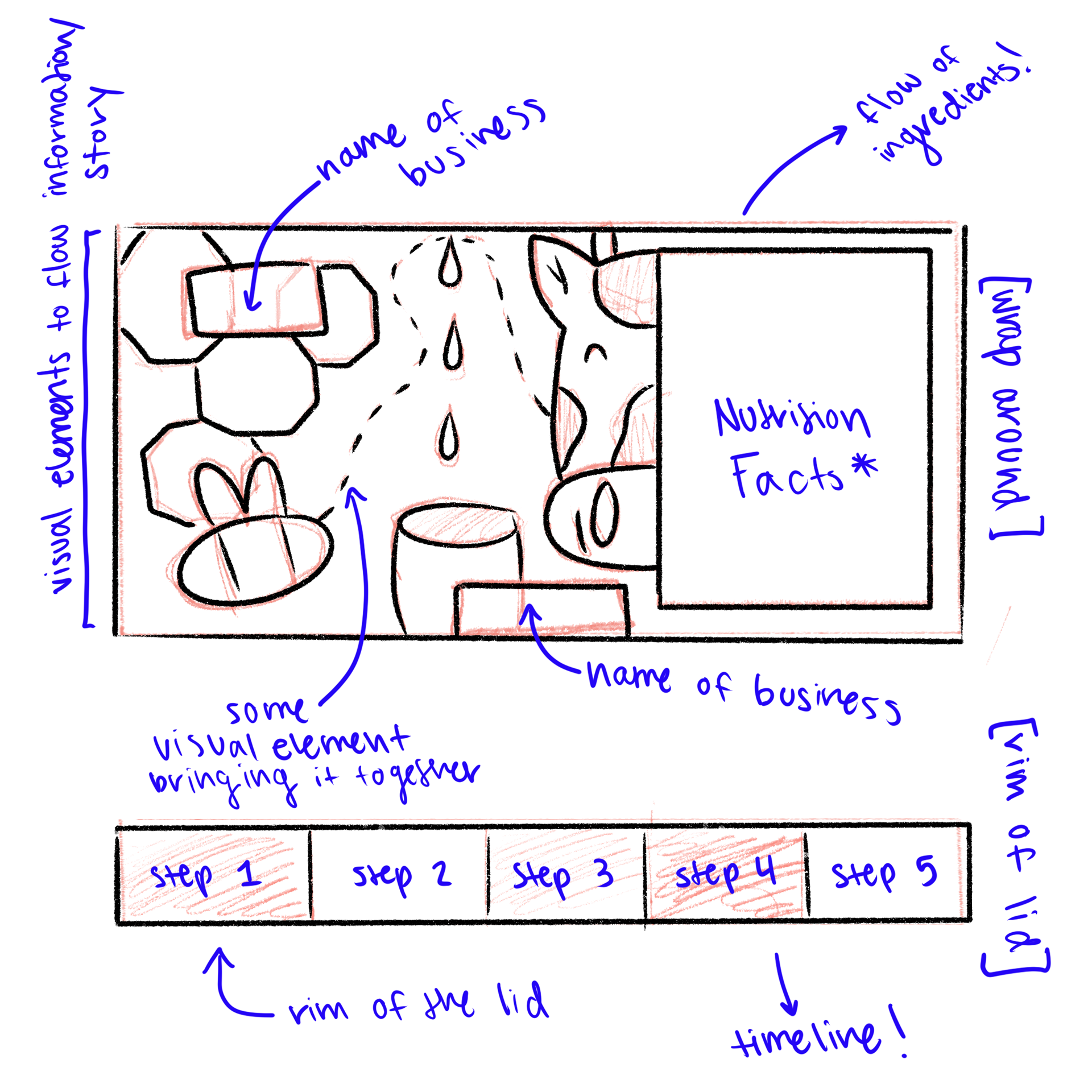
Our group decided to lead with our ice cream idea. This is a sketch of what we envisioned for the composition and what information to include. We wanted to create charts/diagrams/visuals of the production process, nutrition, and ingredients being used. How we were going to structure everything would be developed throughout the project.
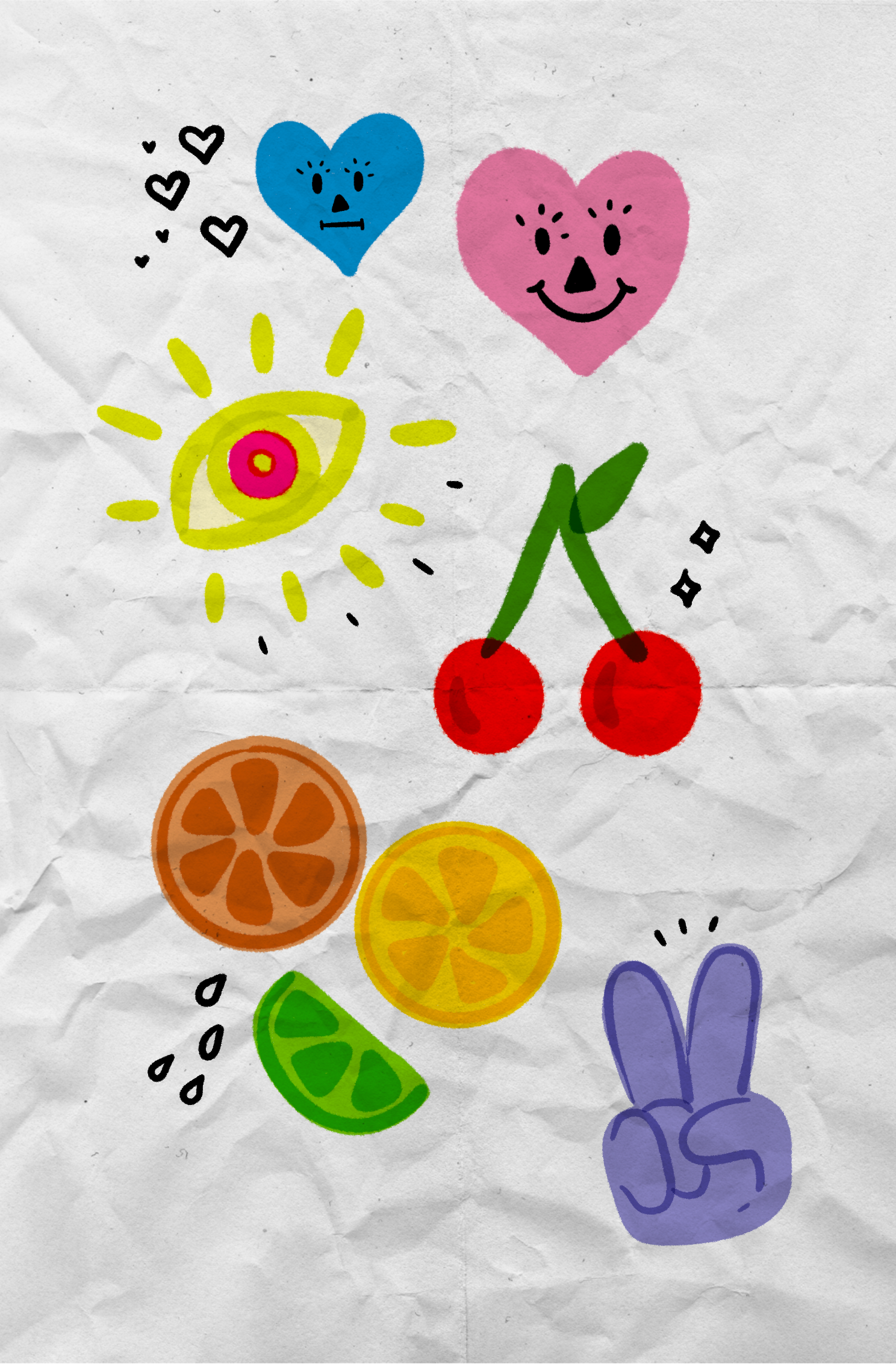
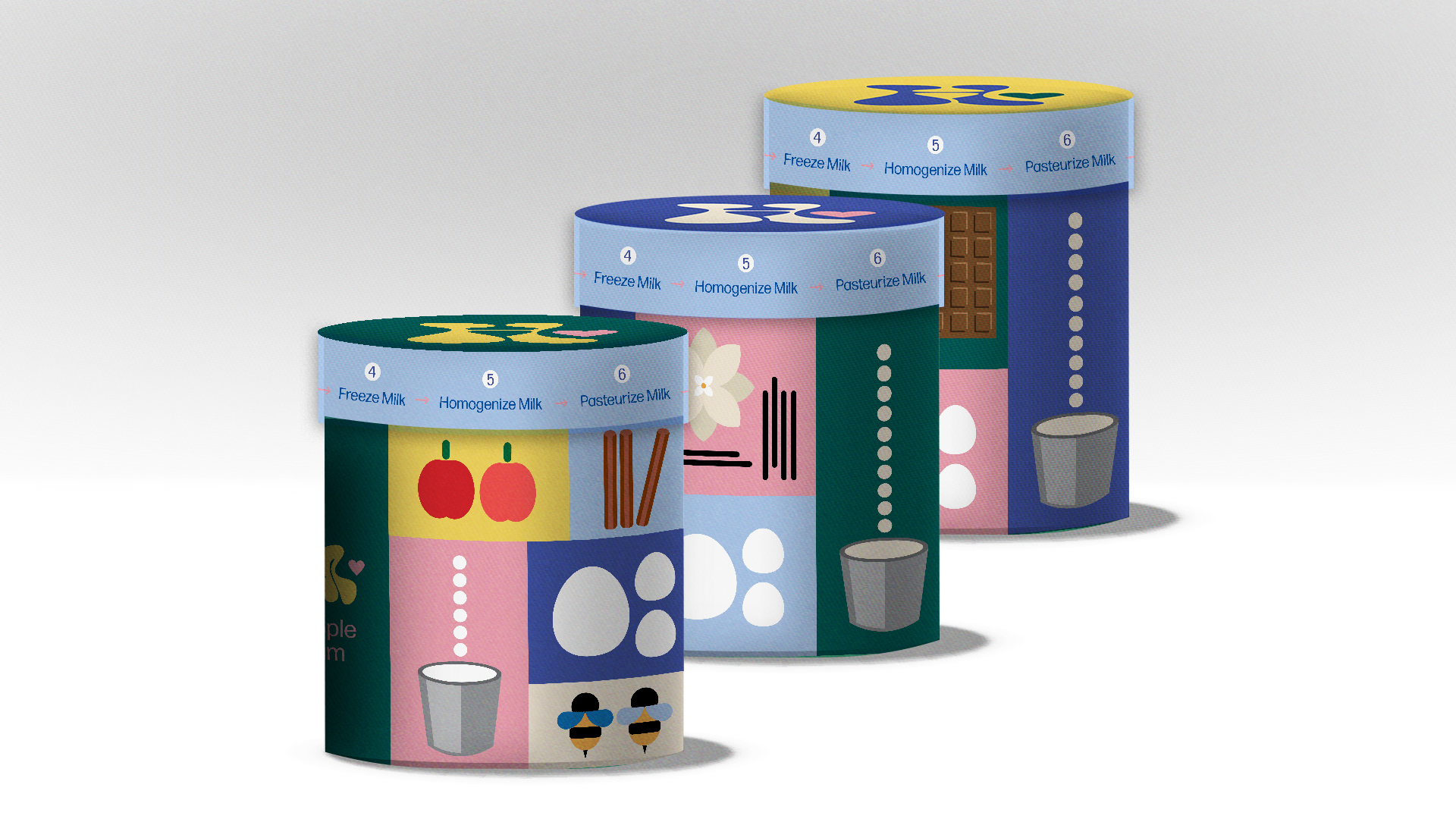
In terms of who's doing what, I took on the role to make the illustrations that would highlight not only the brand but depict what ingredients were being used. This would progress the element of storytelling in our product. I tried out different styles and proceeded to be frustrated about what I made due to my perfectionist mindset (unfortunately). That was until I landed on my designs on the third try.
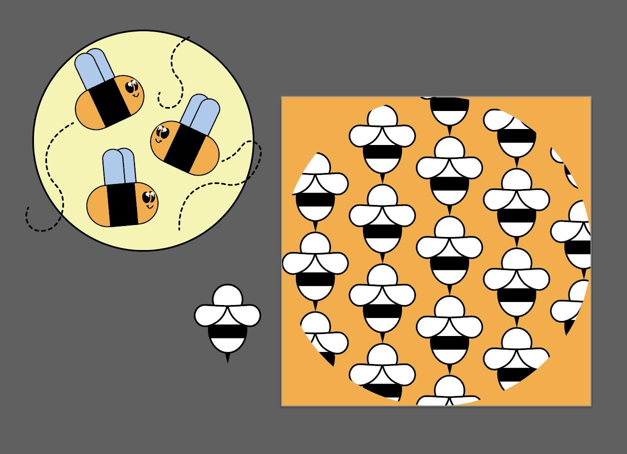
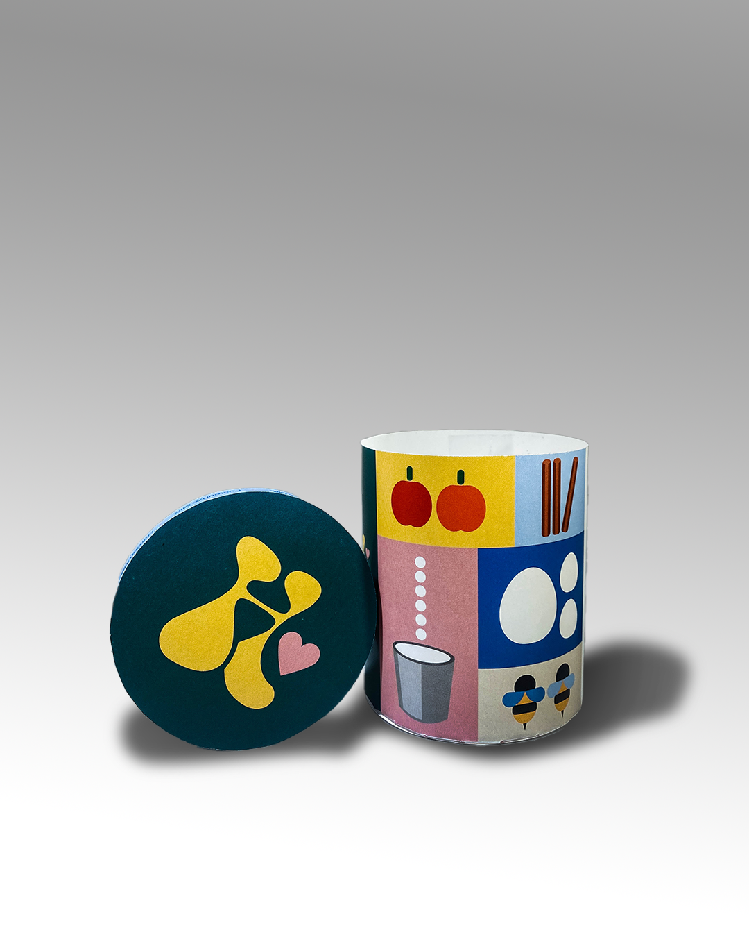
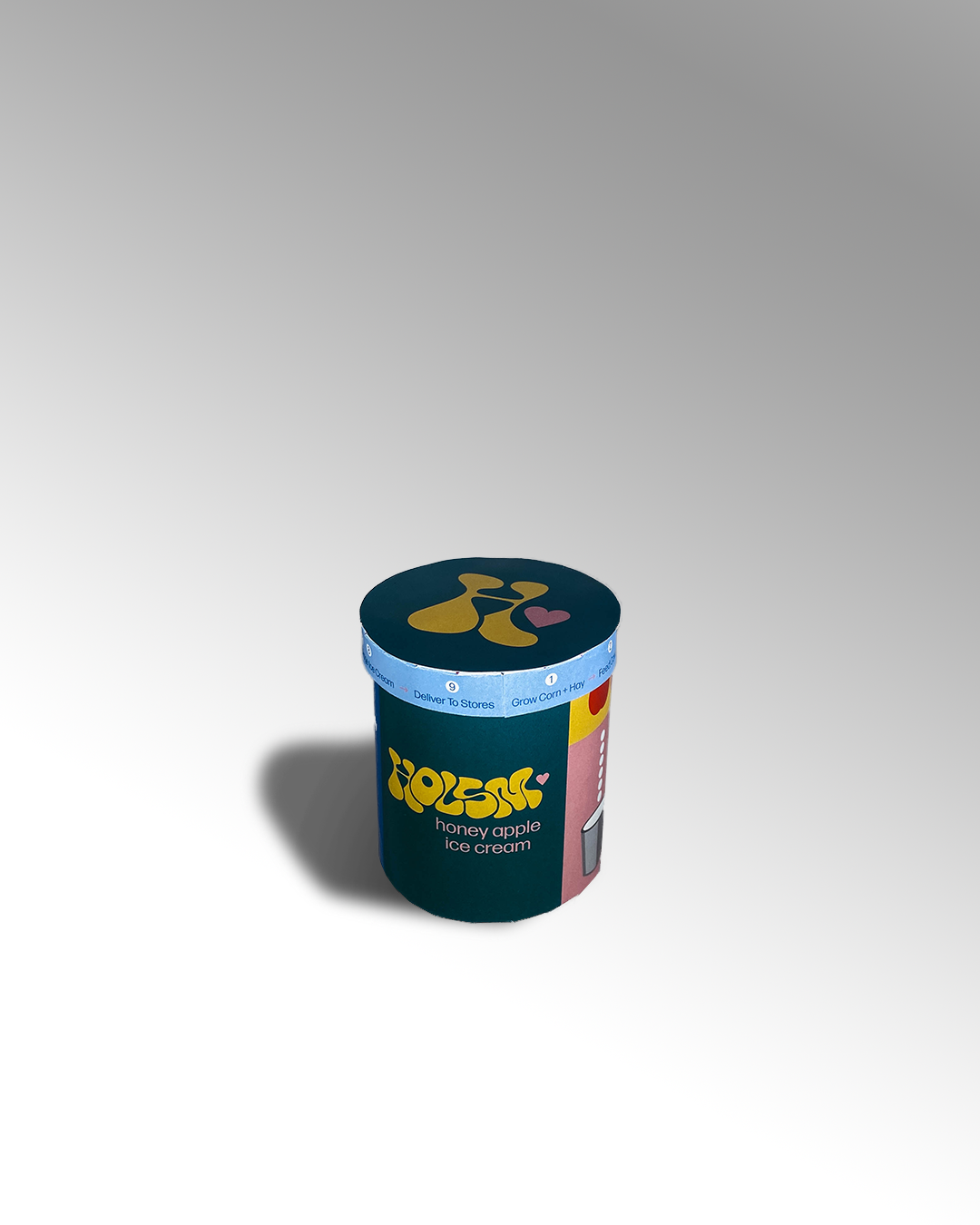
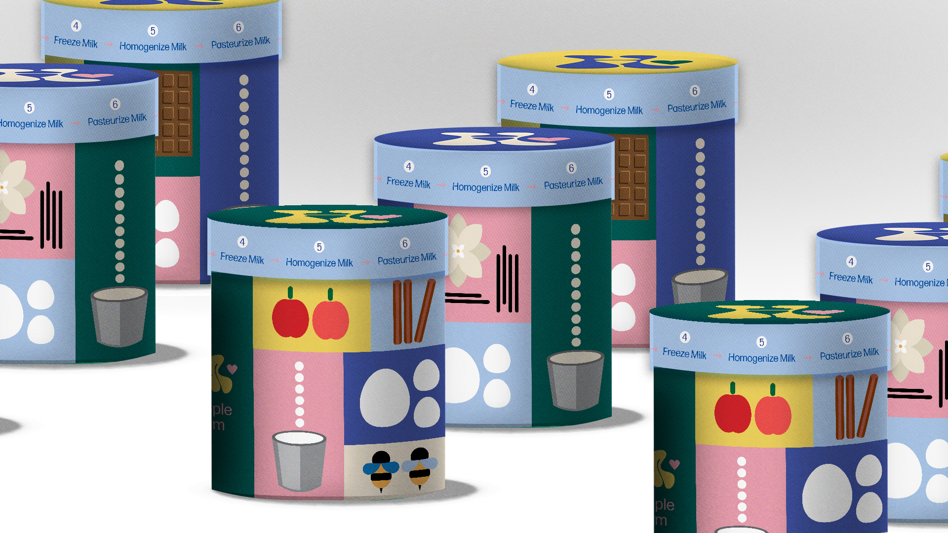
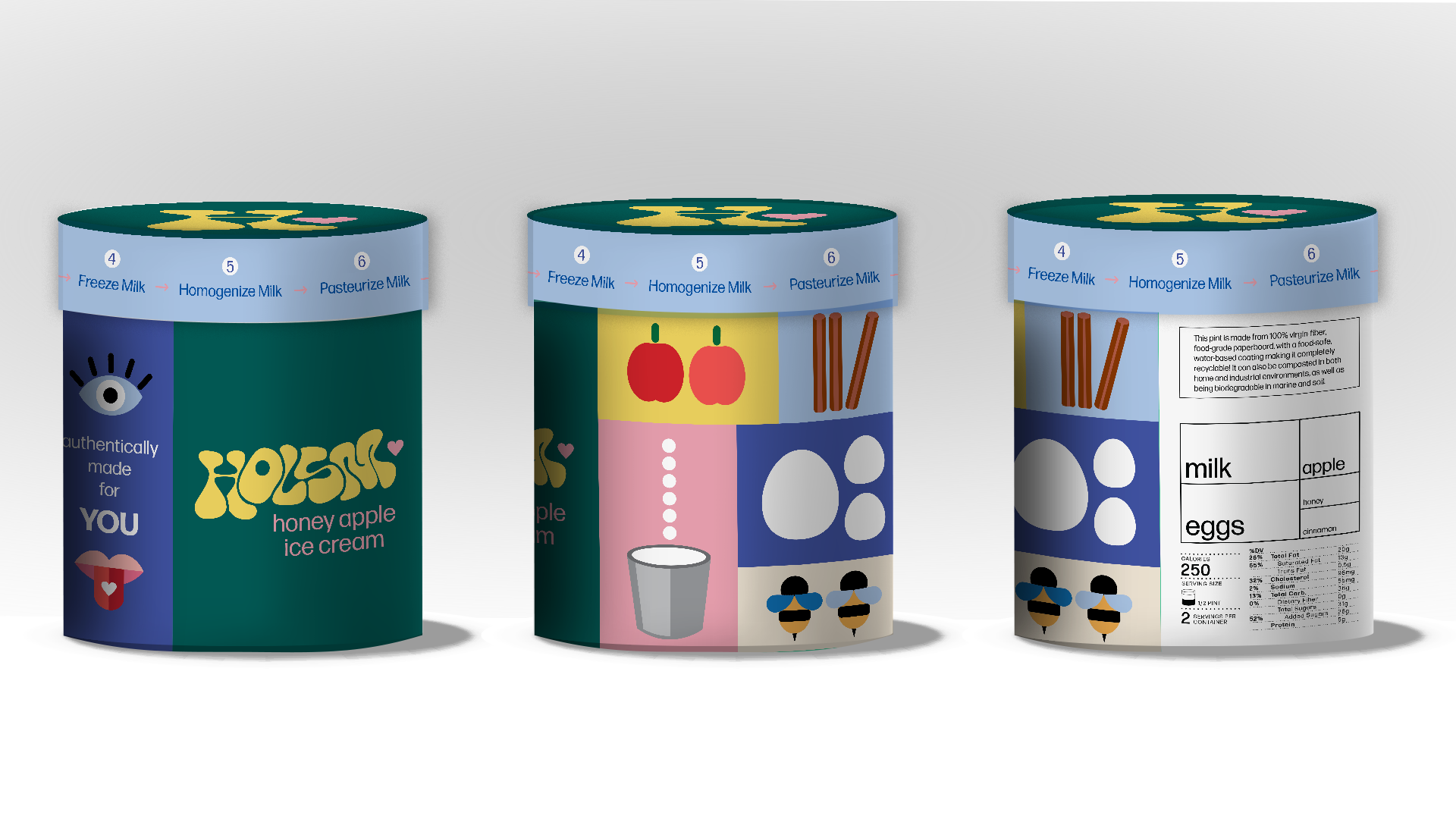
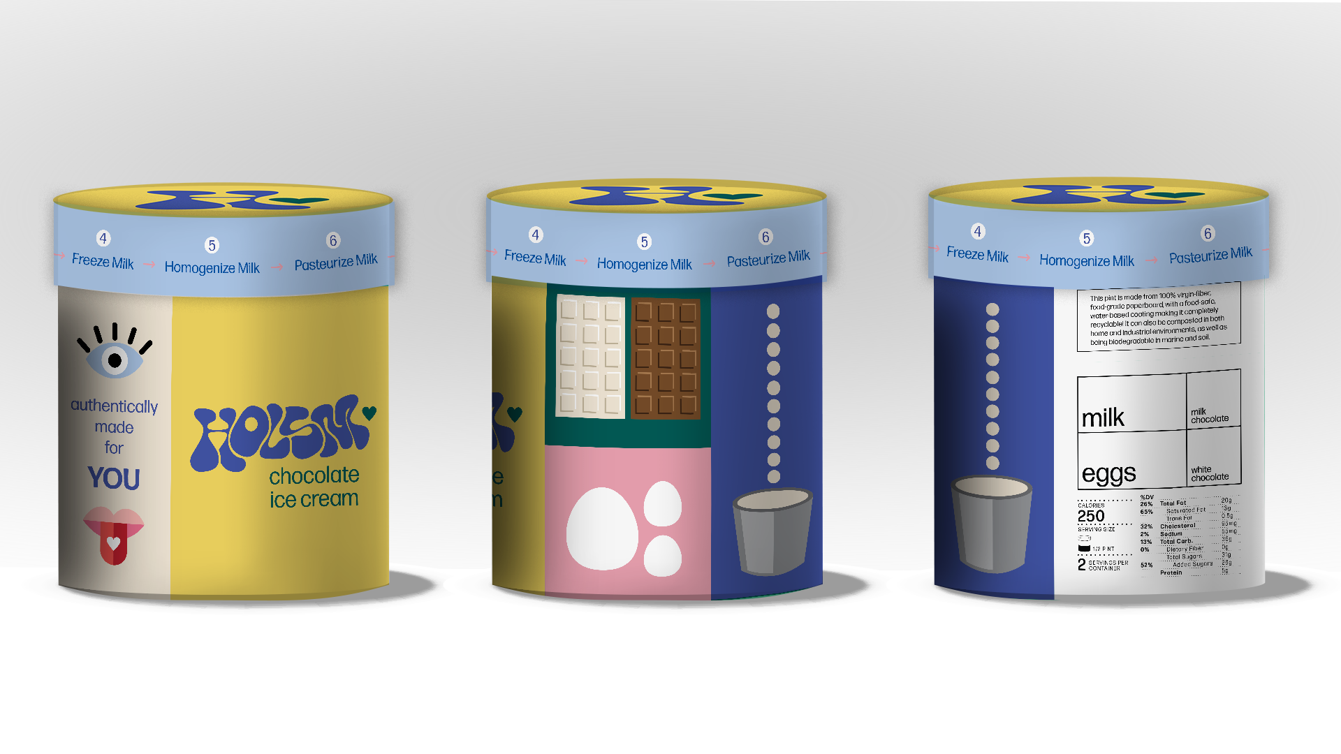
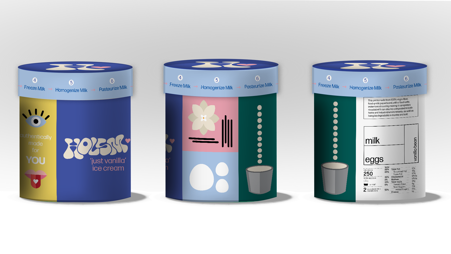
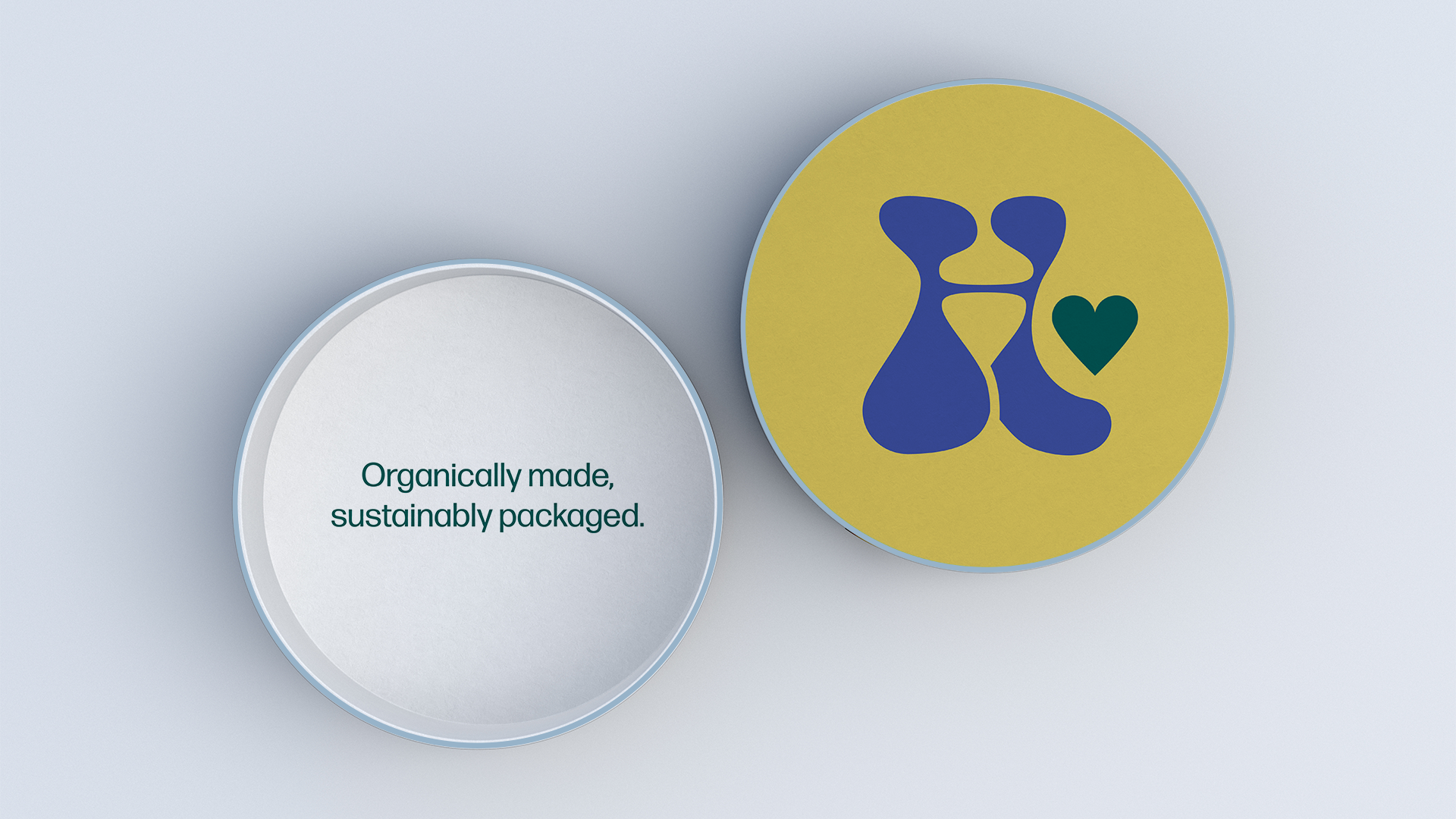
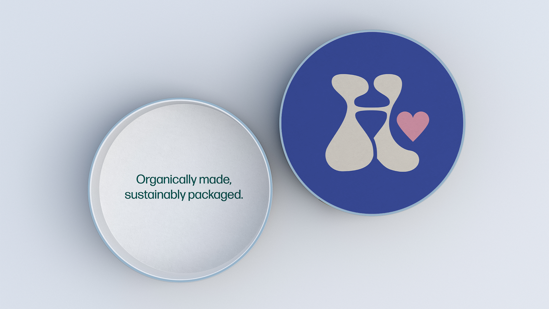
It was here that our group decided to make 3 different flavors to design on the pint: honey apple, vanilla, and chocolate. Lilyana also came up with the imagined brand name, Holsm, along with the typography and Jacob tackled the color palette. I continued with illustrations and how the composition would look on the sides of the pint, this is what I landed on.
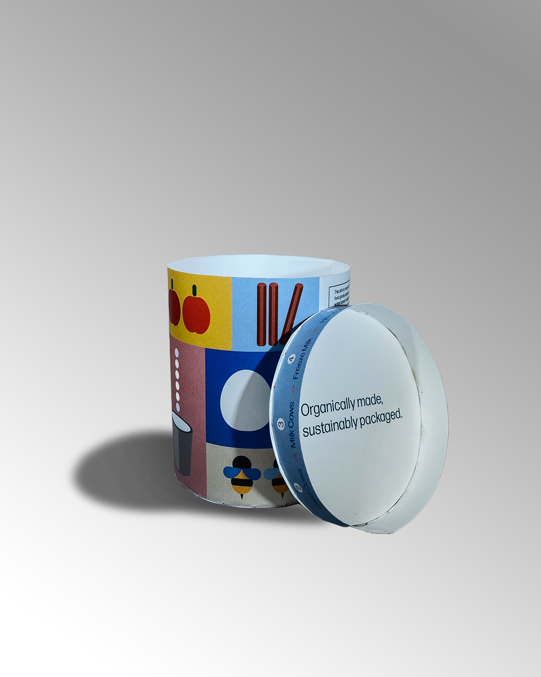
Jacob and I also made our first analog prototype and planned out where everything will go on the sides and the lid (which contained the timeline of the production process). Our plan was to use card stock and glue for the final product.


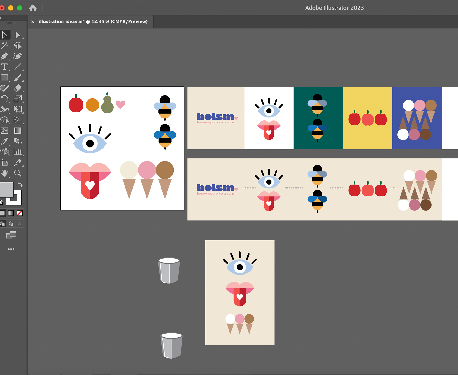
As we continued and wrapped up, we needed to tweak the composition and some design choices. This included making the lid design thinner, shifting parts of the nutrition chart, but overall sticking with the information we displayed. These were the final illustration graphics that I contributed before making the final digital and analog mock ups.
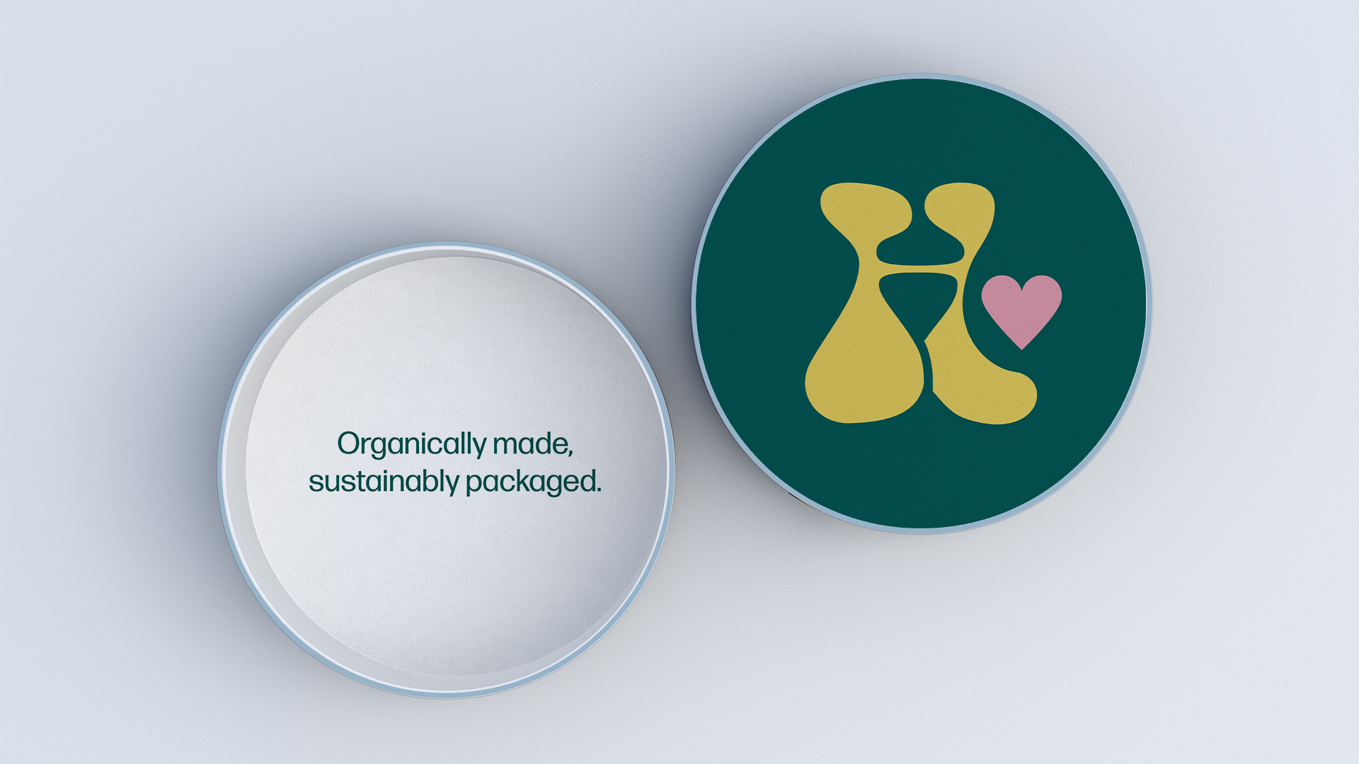
Then adding Jacob's timeline for the lid and Lilyana's nutrition chart, the pint design was complete. We also added statements on the inside of the pints to encourage and inform customers how to recycle the package. Jacob and I made the final analog prototype and I helped mock up the designs digitally. Seeing the development was so cool.

In the end, I am really happy with what our group landed on in the end. My brain is all about making branding that is simple, but having to make something simple while depicting so much information was daunting. However, I believe our use of iconography, statements, charts, and a timeline really accomplished our task of informing, inspiring, and encouraging.
I learned so much about making packaging that held so much informative content while still being creative and purposeful. I wonder how many more flavors we could have gotten done or if we used a different type of package (ie. a glass pint, a tin pint, etc.). We could have spent more ideating on that part but I believe in the strength of what we produced.
Going forward, I will carry on everything I learned about displaying information in a more creative way. Seeing how I can incorporate design elements into informative problems.